I recently spent quite some time reworking the overall look of Boxes' machine thumbnails. Here is the result.

Stopped boxes
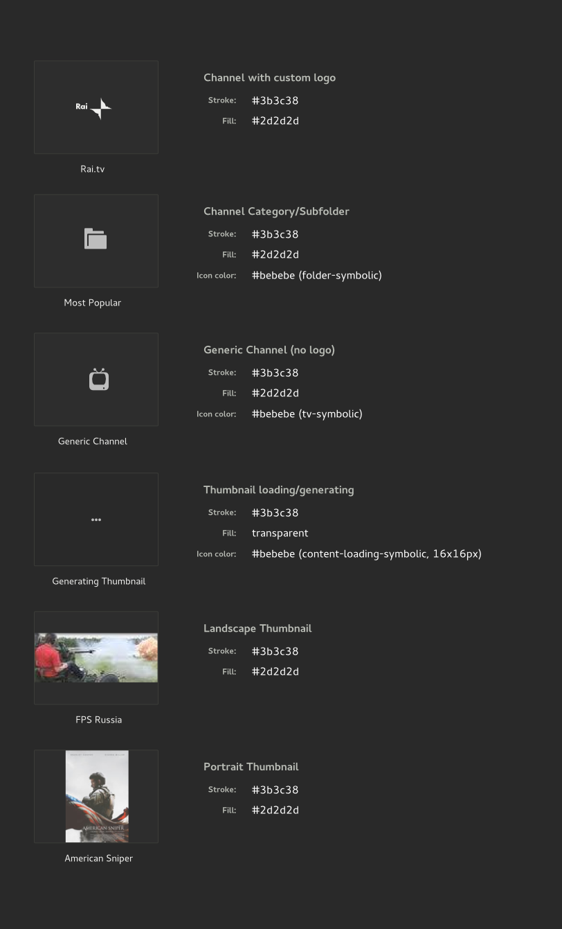
Up until now, Boxes' stopped machines were represented by a black box. It was nice as it represented the idea of a shut down screen, but it was pretty hard to differentiate a stopped machine from a running one displaying a black screen. This was stated in bug #730258 where Jimmac suggested to follow this design where thumbnails are draw as gray frames with a medium sized emblem in their center, using the system-shutdown-symbolic icon to suggest the stopped state.


|
| Boxes' thumbnail for stopped machines: old (left) and new (right) |
Updating the other thumbnails
Machines under construction used to simply display their thumbnail with a spinner on top. This doesn't change but stopped machines being constructed now display their spinner in a frame, to be consistent with the new thumbnail for stopped machines.


|
| Boxes' thumbnail for machines being imported: old (left) and new (right) |
The default thumbnail for machines was a big computer-symbolic icon. It have been changed to the new gray frame style, keeping the computer-symbolic icon as the thumbnail's emblem.


|
| Boxes' default machine thumbnail: old (left) and new (right) |
Thumnails are now consistent, elegant, and the machine's status is more understandable.
Working on this feature helped me to discover bug #751494: GDMainIconView draw pictures without their last column of pixel.
Favorites
The way a machine is shown as favorite has also been revamped. A big heart shaped icon (the emblem-favorite-symbolic icon) was added to the bottom right corner of the thumbnail, and this was causing multiple problems (see bug #745757):
- the standard icon to show something is favorited is a star (the starred-symbolic icon),
- and more importantly, its position was conflicting with the one of the selection checkbox!


|
| Boxes' emblem for favorite machines: old (left) and new (right) |
A machine is now shown as favorited by adding a tiny star to the bottom left corner of its thumbnail.
Unfortunately, problems still exist as the white star becomes invisible on a white thumbnail (see bug #751478). I tried to solve this problem, by making the star casting a shadow, which worked well but it required me to implement a blurring function into Boxes' code, adding 100 lines of Vala to an already complex codebase for one tiny functionality which has nothing to do with the application's domain, hence this solution haven't been retained.


|
| The 'favorites' emblem with and without a shadow |
Zeeshan suggested trying to solve this by using the image's energy, as the code to do such a thing already exists. This solution still has to be explored.
Commentaires
Enregistrer un commentaire